Aesop’s Fables
In this expressive type project, each student designed a two-page spread for one of Aesop’s Fables, exploring creative and unconventional ways to present a story visually. We experimented with language, typography, layout, and narrative conventions. The objective was to encourage readers to interpret meaning not only through words but also through the visual arrangement of the content.
My roles
Develop conceptual and typographic approaches
Design layout
Produce the final print
Design solutions
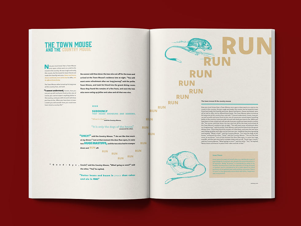
I designed a two-page spread for Aesop’s The Town Mouse and the Country Mouse. The spread contrasts two lifestyles by dividing the layout into two columns based on the story’s settings. The first column represents country life and is presented as peaceful and soft, while the second column depicts town life through larger, denser text to convey its busy and overwhelming nature. The increased word count in the second column emphasizes this sense of chaos. The word “run” increases in size to convey the urgency and fear felt when the mice encounter the dogs.


See more work


